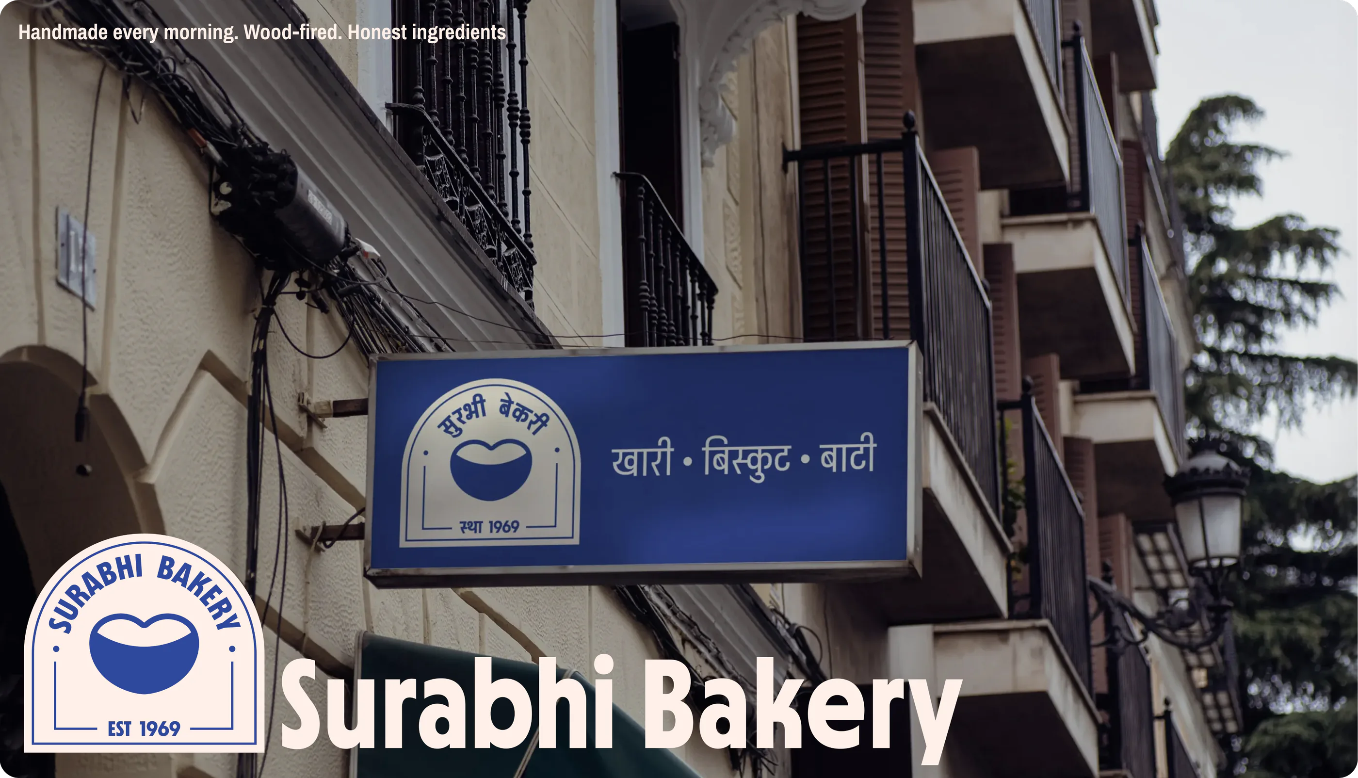
Surabhi Bakery - Brand Identity
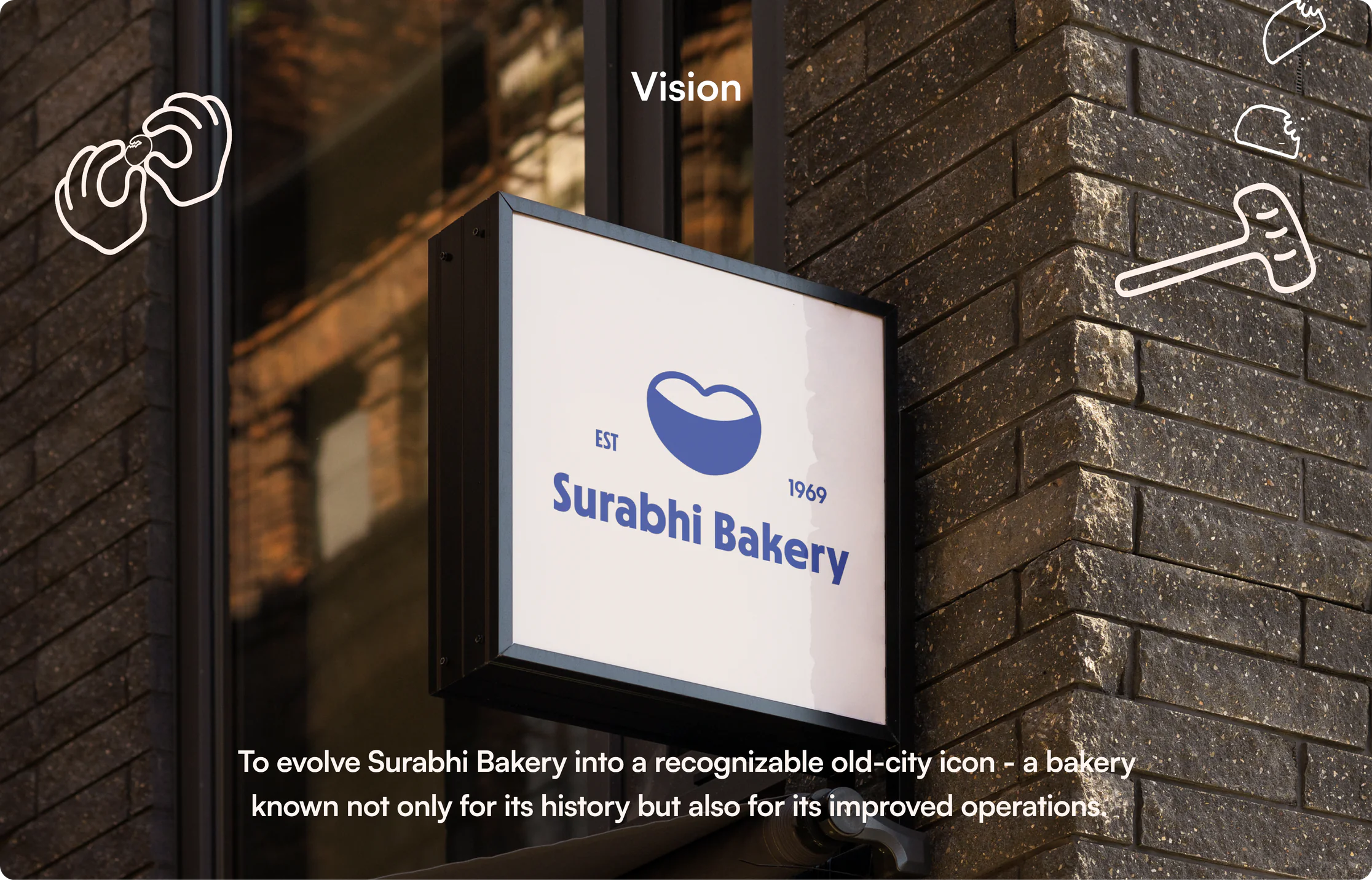
Project Vision
A 55+ year-old neighbourhood bakery located in the old city of Jodhpur. Known for its handmade biscuits, khari, nankhatai, and everyday baked goods, the brand has built strong trust within the local community, especially among working-class customers.
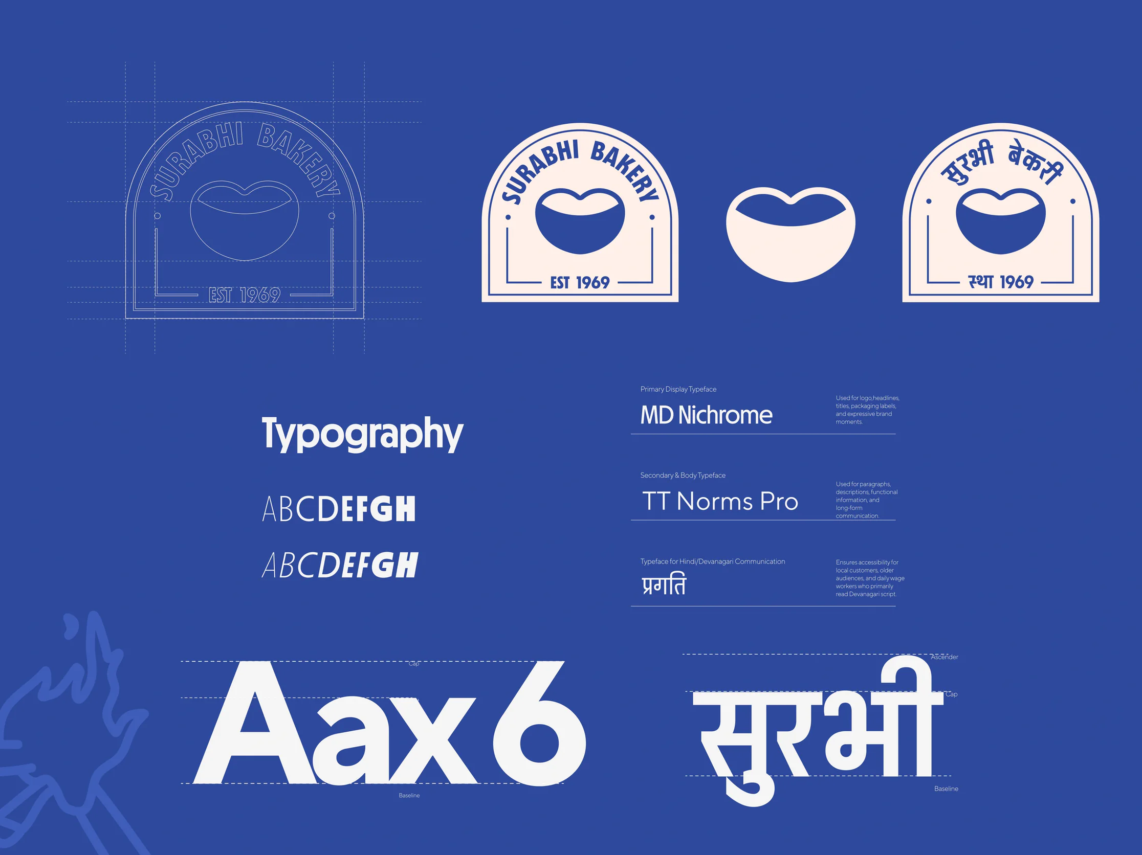
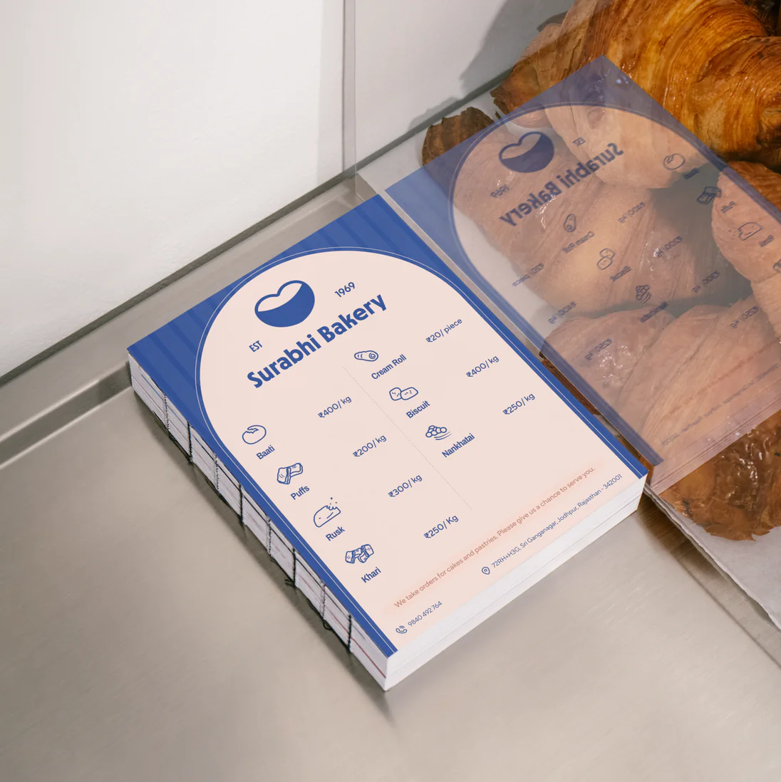
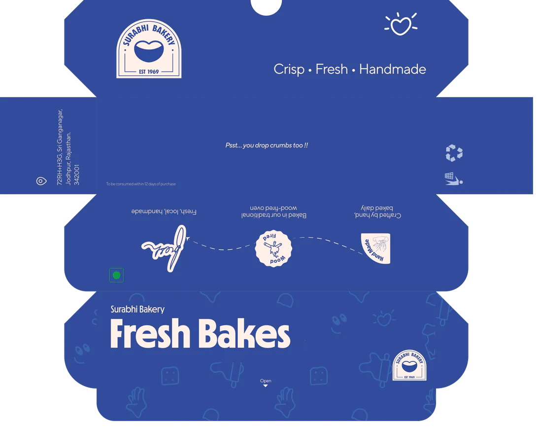
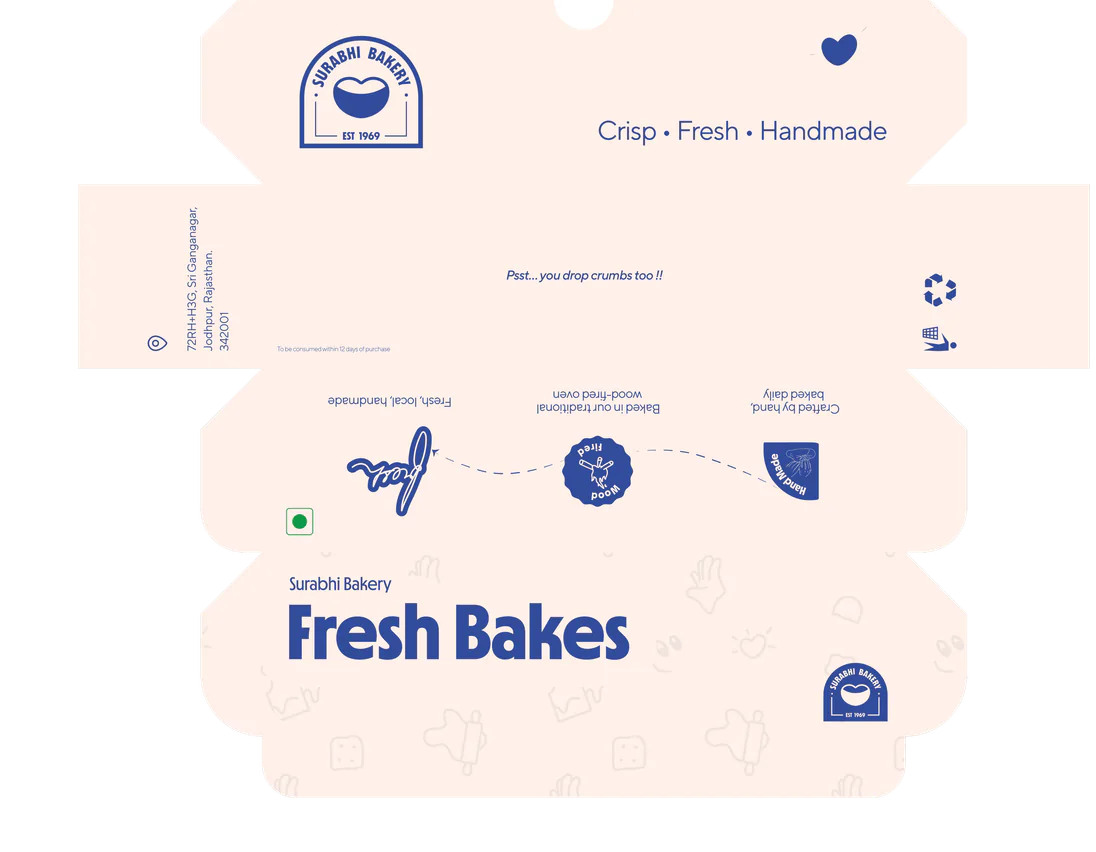
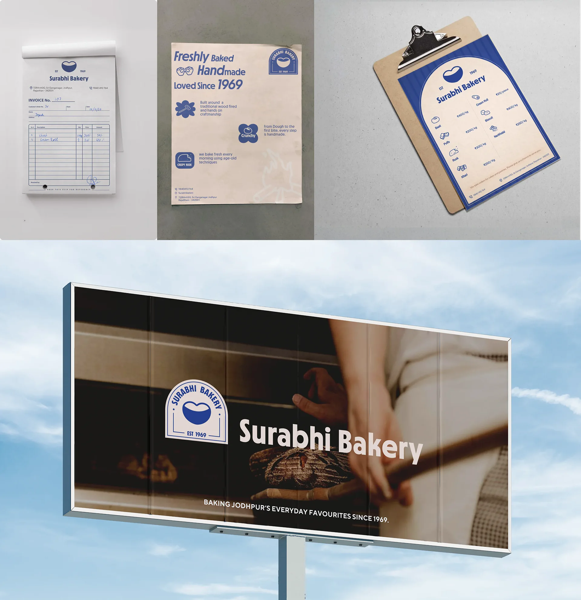
This project focused on creating a cohesive and scalable brand identity system that preserves Surabhi’s heritage while improving its visual clarity, communication, and overall perception.
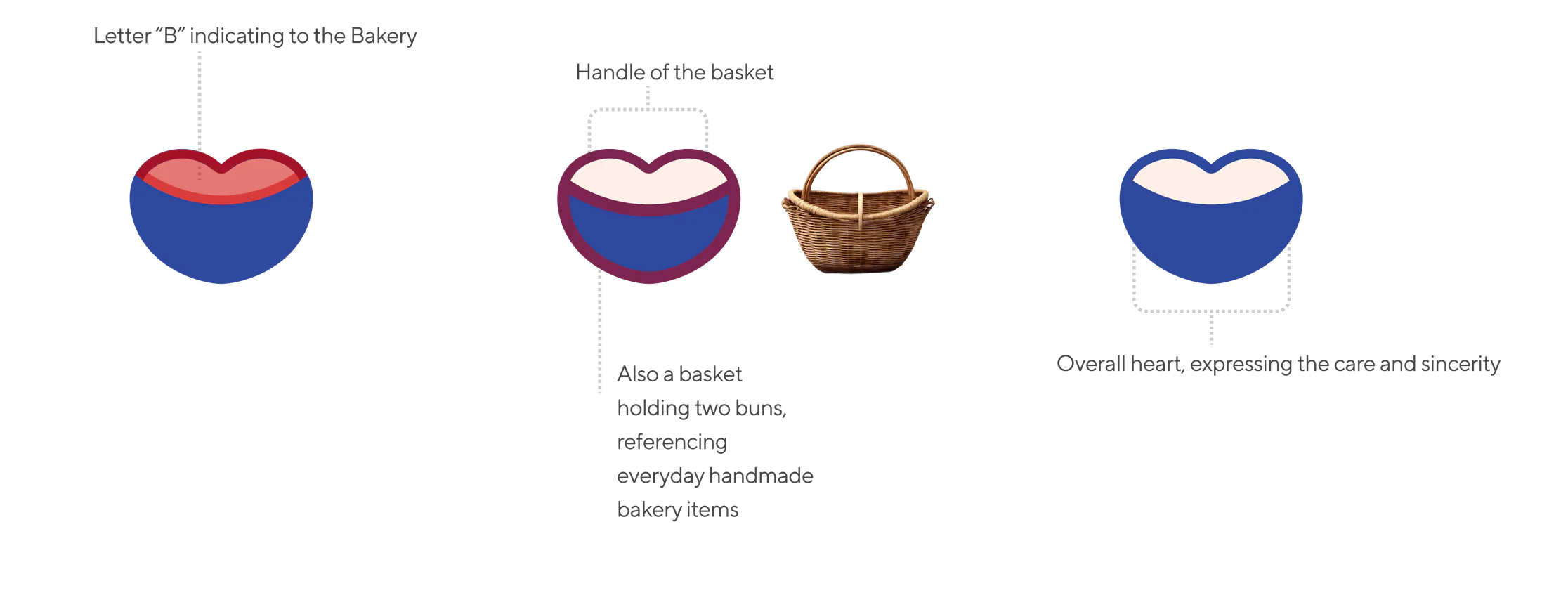
Logo Overview

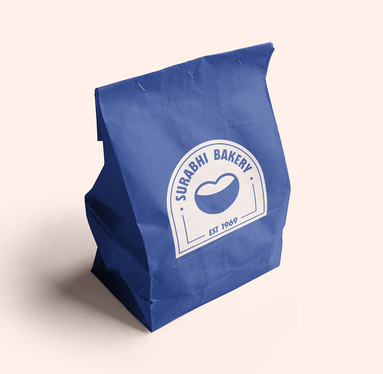
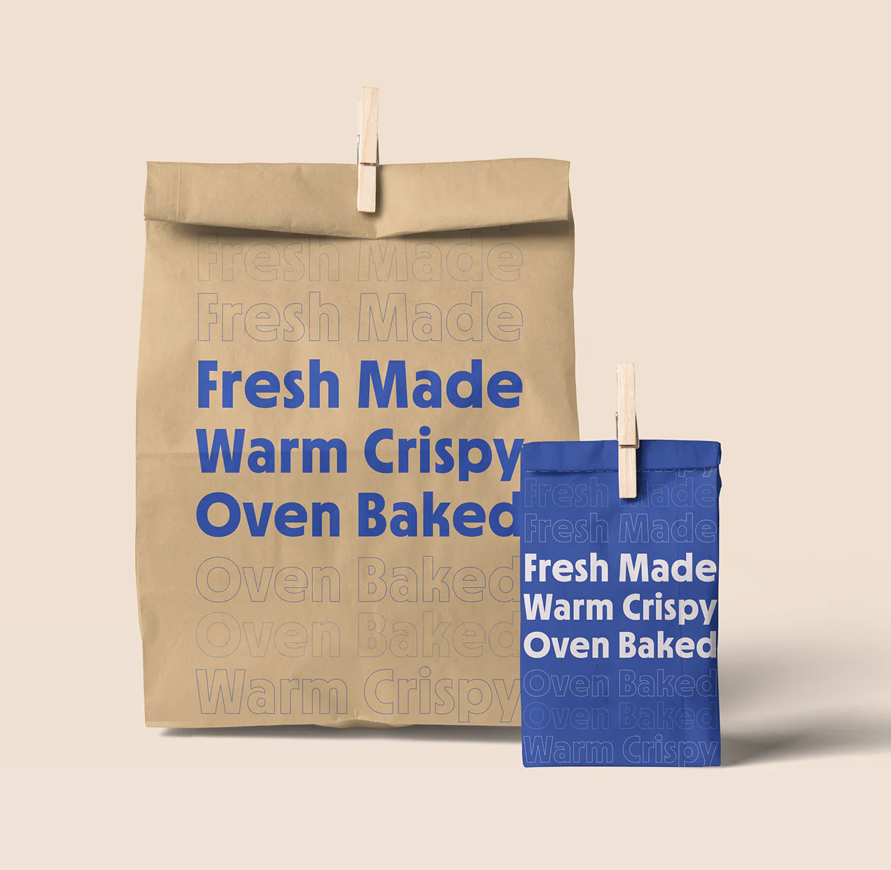
Packaging
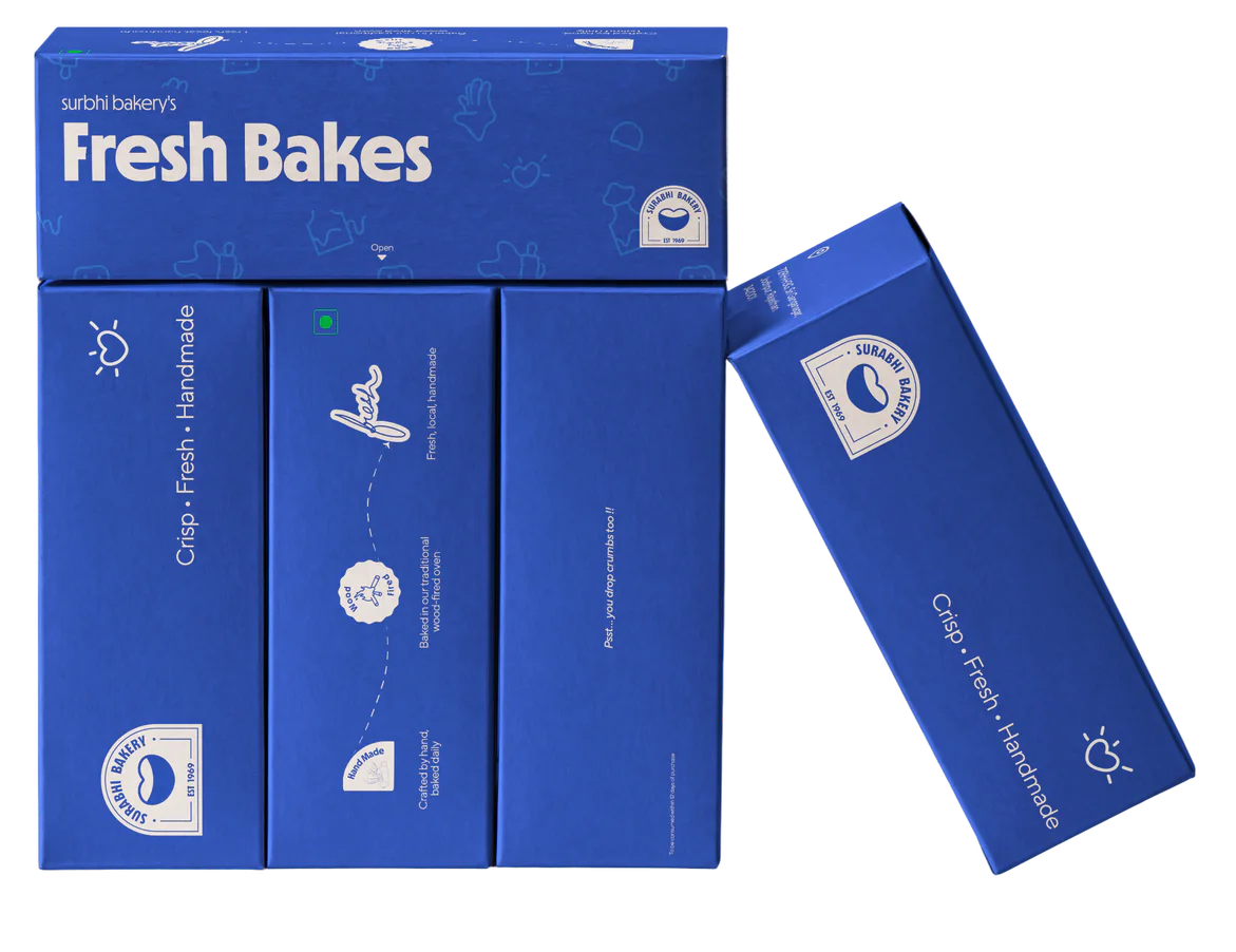
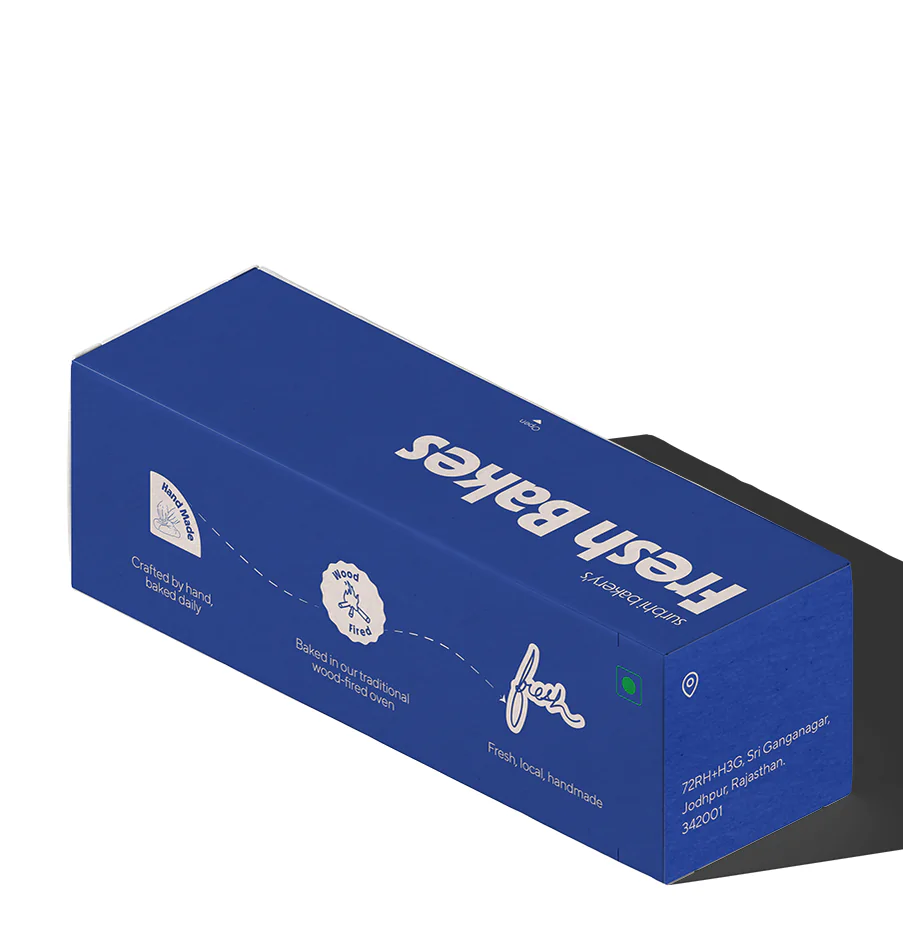
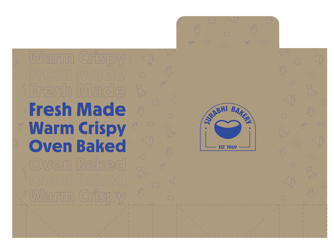
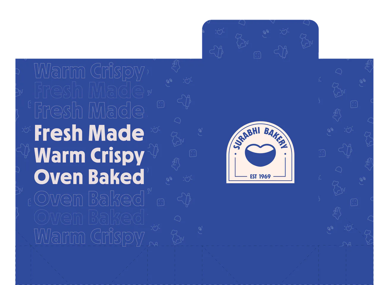
Color System
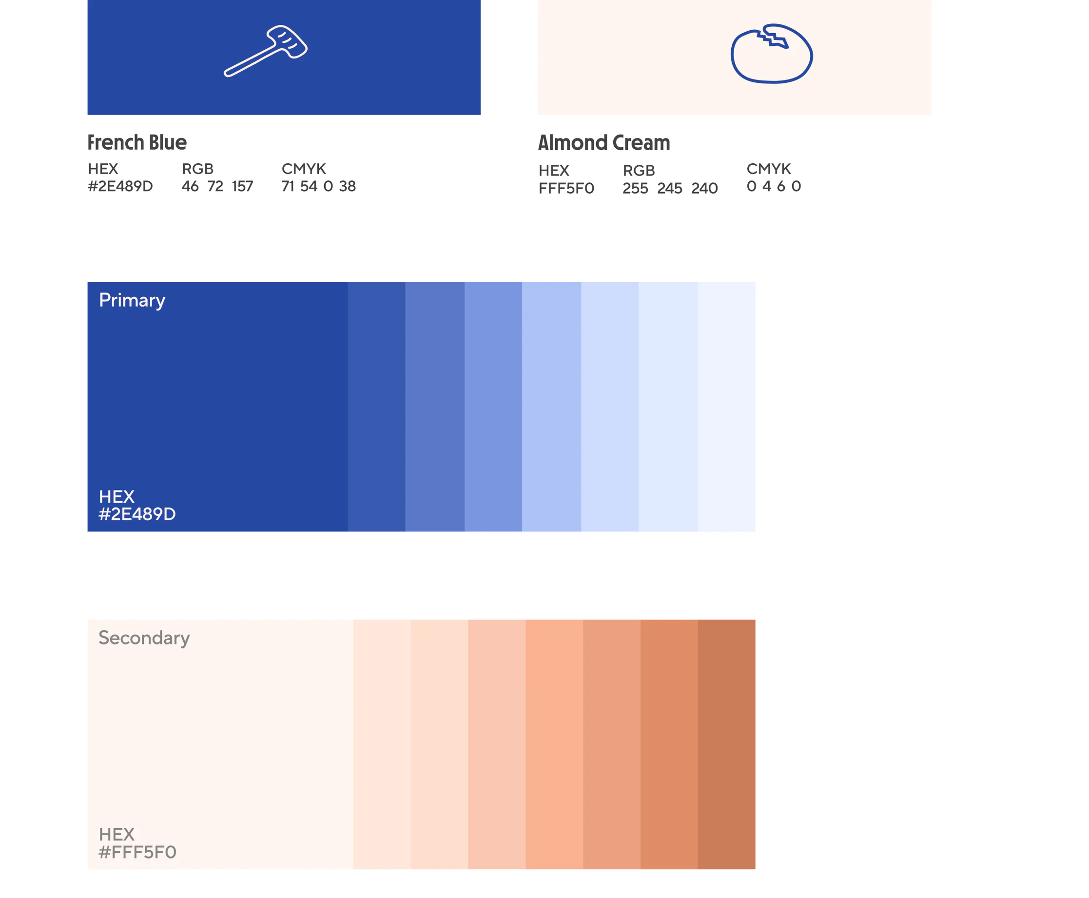
French Blue represents trust, tradition, and reliability.
Almond Cream brings warmth, comfort, and sincerity to the brand.
Pattern System
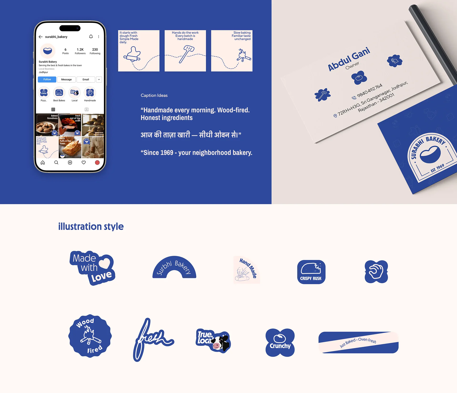
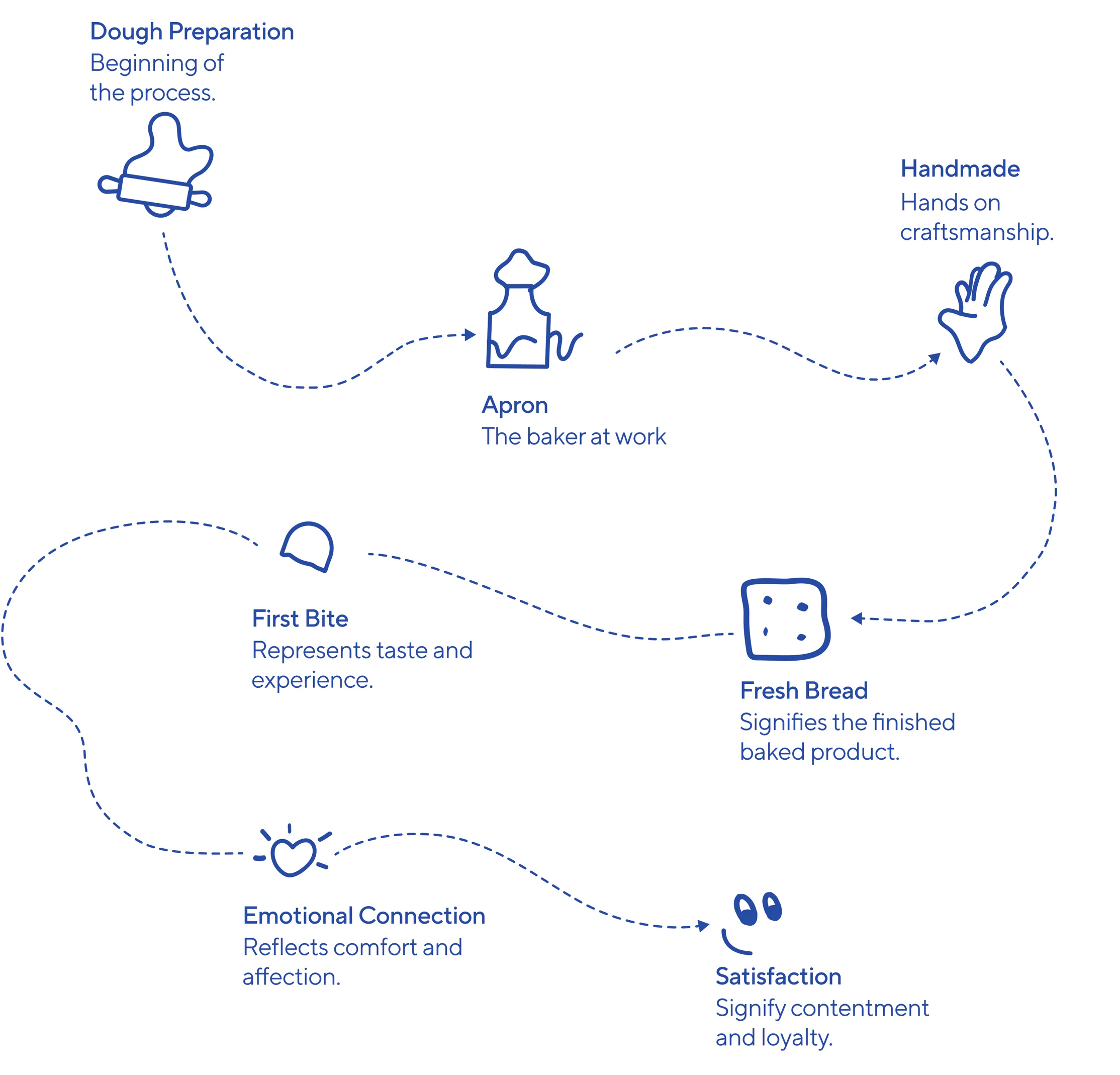
From Oven to Satisfaction
Illustration system is built as a visual narrative, a journey that reflects the everyday process of baking, serving, and satisfaction..
Research and Design Process
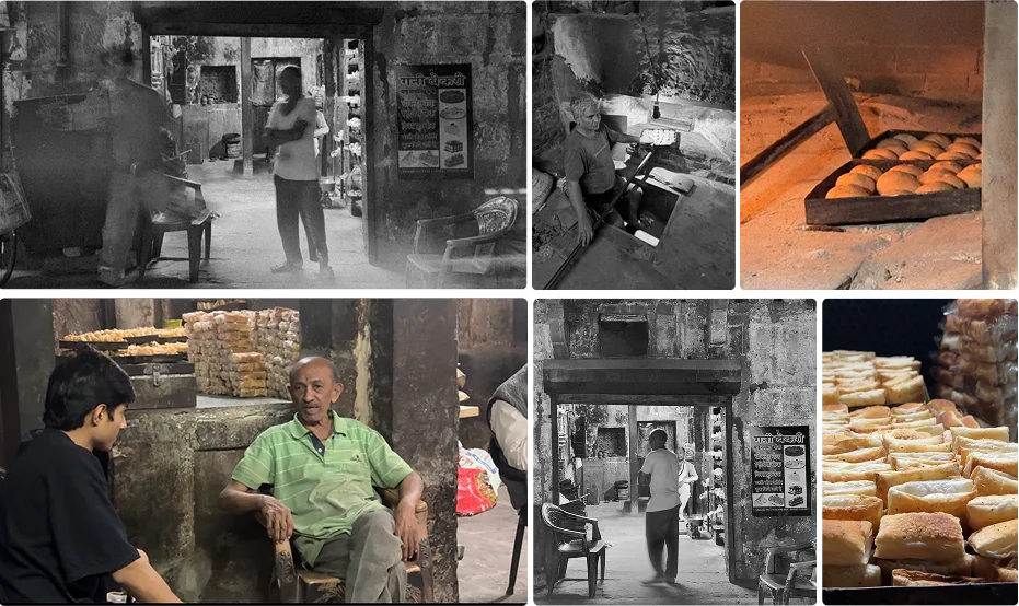
Surabhi Bakery is a functional, no-frills space with high-quality products but lacks a consistent visual identity. Discovered organically in Old Jodhpur, the brand’s strength lies in its sensory authenticity rather than its branding.
The challenge was to translate its core values—handmade craft, affordability, and community trust—into a cohesive design system that respects its roots while providing the clarity needed to compete with modern bakeries
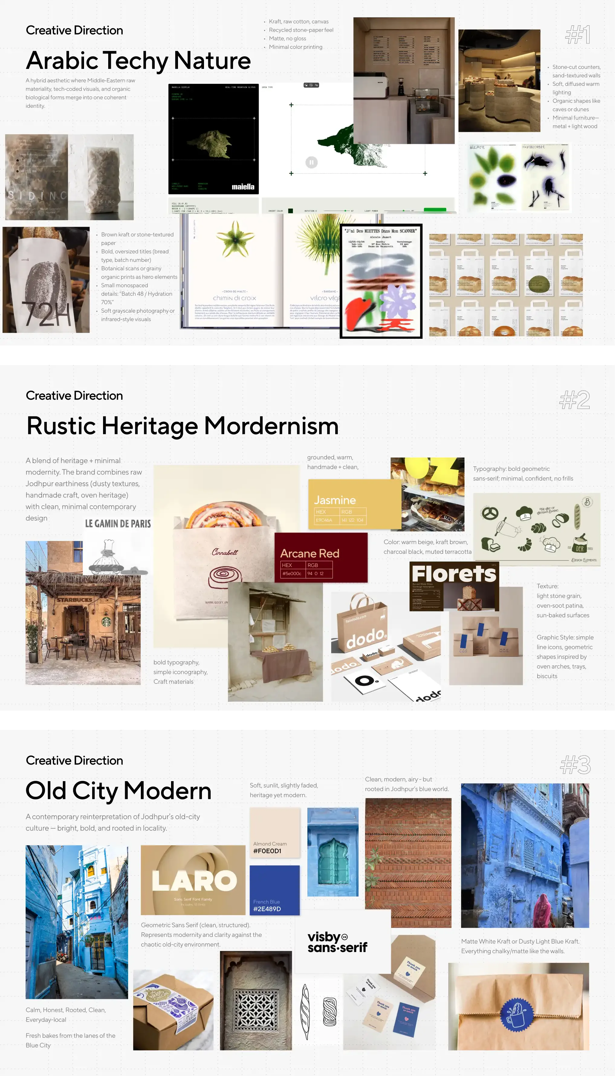
Creative Direction
We explored three creative paths and chose the one that most authentically reflects Surabhi's raw, timeworn legacy and 55-year history.